I researched other forms of advertising such as billboards and online adverts to get a sense of how brands create consistent marketing campaigns across different media platforms. It was also a good way for me to understand the importance of good slogans, logos and focal images that are used to grab audiences attention.
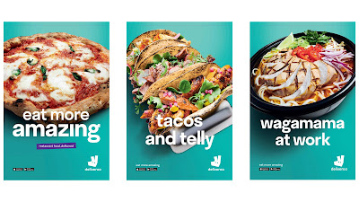
I particularly liked Deliveroo's print adverts that I have embedded below.
 |
| Print adverts |
They all use:
- bold turquoise background colour
- white on screen text
- a strong focal image of delicious looking food
- brand logo in the bottom right corner
- a link to the app store for the audience to download the app
- the slogan 'eat more amazing'
Two of them also use alliteration to make the on-screen text stand out more. This is a clever technique used to grab the audience attention as the phrases are catchy and memorable. They also refer to different places/things that relate to the audience as 'work' and 'telly' are things that are part of their routines. Finally, the reference to Wagamamas, a well known and loved brand, suggests that Deliveroo are also a brand that should be loved and respected.
 |
| Advert on a billboard |
Above we see a billboard advertising Deliveroo. It uses the same bright turquoise colour and white text as the print posters, making the advert instantly recognisable as Deliveroo.
 |
| Deliveroo app |
 |
| Deliveroo website |
The website and app also use the same colour scheme and font as the print adverts and so they are consistent with Deliveroo's branding. The easy way to order food and be able to track when it is coming is also very appealing to the audience as it shows them that Deliveroo is a quick and reliable service.
 |
| Screenshot from a Deliveroo advert |
The Deliveroo TV advert is also consistent with the other forms of advertising. The commercial shows giant food floating around the city. This image of food is seen in the focal images on the billboards, posters and online advertising for Deliveroo.
I learnt a lot about synergy and creating a strong marketing campaign from this research. It is essential to make sure that your branding is consistent across all media platforms to make your brand instantly recognisable to the public. I discovered that brands typically use the same colour palette, font scheme and similar focal images in all forms of advertising to create synergy. I am going to do this in both of my adverts in order to create a strong marketing campaign.

No comments:
Post a Comment